Muskoka Royals Ringette
When I was hired by the Muskoka Royals to create social media templates, I found the their logo to be very difficult to work with. The 3D lion head, with the 2D crown, the shadowed ringette sticks, and the background oval were all fighting for priority. When a logo isn’t cohesive, it doesn’t work well as a starting point for a branding initiative; this one was no exception.
I convinced the client to let me update the logo. I was granted permission and did so on my own time because a. the client hadn’t budgeted for a rebrand and b. I thought I might go crazy else.
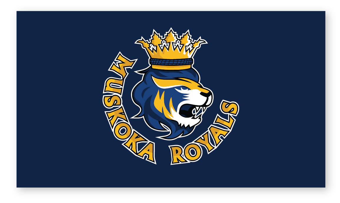
I tweaked the colours – going with the most current jersey colour, gave the crown a three dimensional look so it fit with the lion, got rid of the oval entirely.
The client approved this version – but I still felt like it didn’t go far enough; I wanted to push it further. For a week I couldn’t leave the logo alone; Every time I looked at it something else jumped out at me that needed fixing. Eventually I decided a full edit was needed. The most important aspects of this particular logo were the lion head, crown, and text. Once I had reduced the visual elements, it was much easier to come up with a pleasing design. The result is much simpler, memorable, and is also legible at a smaller scale.
The Royals had initially avoided a full rebrand, wanting to ensure continuity with their current sports equipment. To my great satisfaction, despite this, the committee unanimously embraced the new look and are rolling out the new look this coming season.
